Weekly Intensities of training workouts
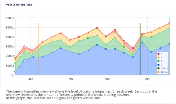
The Weekly Intensities chart illustrates the distribution of the number of points related to the different workouts in the different categories that you will be exposed to over the shown period of time.
The example shows training up to two events. The orange vertical line illustrates today as January 6th.
The first green vertical line is January 26th, the Danish Indoor Rowing nationals, 2000 meters. The second green vertical line is March 26th, the Head of the River in London 4 ¼ miles (about 6000 meters)
The large blue area illustrates category D workouts, strength, and endurance training. The graph shows that around 60% of training is targeted with workouts in category D. The category C workouts are illustrated in green, category B in yellow, and the anaerobic workouts in category A in red.
The y- axis represents the total amount of points per week. The number of points increases over time, so you will be exposed to more training since you should be getting in better shape.
The dips in the curve, just before the events marked with vertical green lines show tapering before the events. The tapering is where you rest the body and get ready for the next week’s load.
Let’s imagine that due to the Pandemic, the first event, the Danish indoor rowing at the end of January got canceled. If the first event from my events is deleted, the Weekly intensities will change the training plan quite radically. Less high-intensity training targeting training to the 6K event at end of March.
Now let’s say due to work on the river Thames the distance for the event at the end of March got shortened from 6K to 2K, it will also radically change the content of workouts in the program. More C, B, and A category workouts and less D category, steady-state training.
Use the weekly intensity chart to help prepare for the training weeks ahead. One might be a bit more tired than usual needing more rest and more to eat.
Sleep, Eat, Row and Sleep


